
WILDERCROFT
> logo_design
From concept sketches to the ultimate gaming studio identity. A logo that embodies ascension, craft, and wilderness.
Initial Sketches
Design Iterations
Perfect Identity
Scroll to Explore
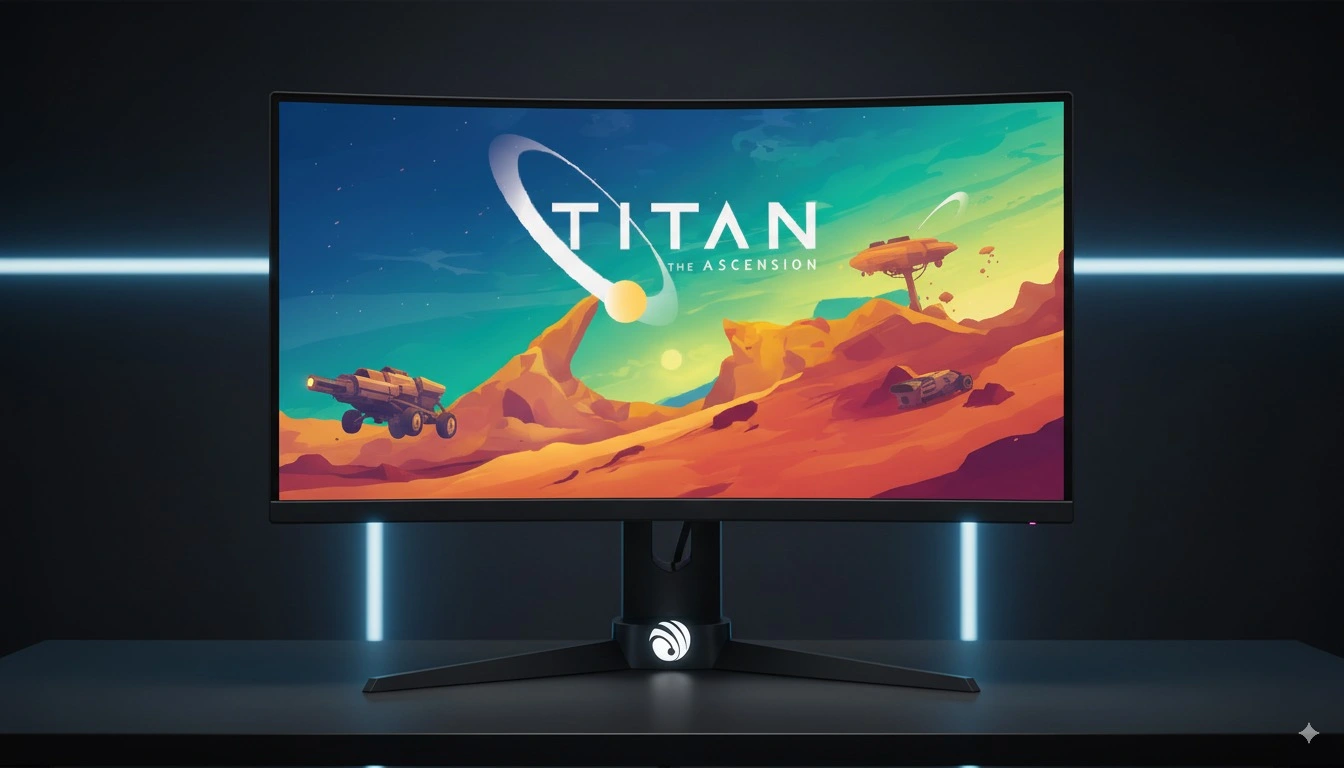
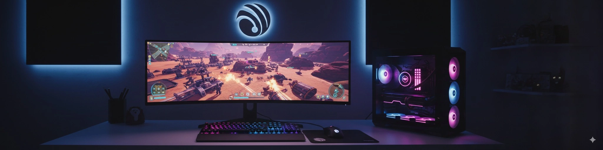
Pre-order the sci-fi strategy game Titan: The Ascension
PRE-ORDER NOW FOR $14.80Watch Titan: The Ascension in action! Get a glimpse of the challenge and excitement that awaits!
Imperium BCE: Build, strategize, and conquer in real-time 3D. Find out more on Steam!
Titan: The Ascension Demo is available! Contact us to get Demo access and experience the game firsthand.
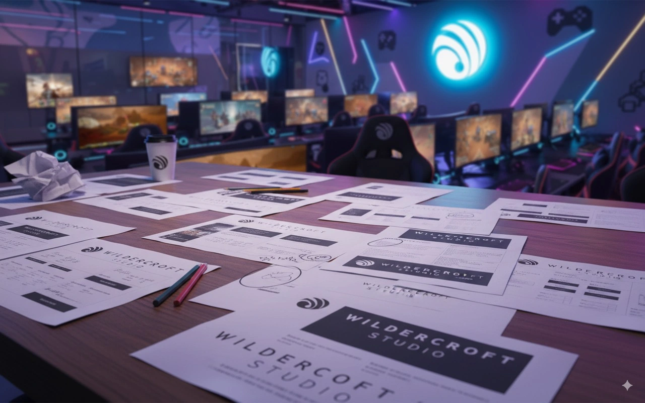
Crafting Identity
with Purpose
Transforming a blank canvas into a living brand system—rooted in story, built for scale,
and designed to move people.
01
VISION02
CRAFT03
IMPACTWHAT DRIVES WILDERCROFT
Design with soul. Built for impact.
We craft identities that feel inevitable—where visual language, voice, and motion align to create memorable brand experiences across every touchpoint.
- Story-first frameworks that scale with your brand
- Beautiful, legible systems for real-world usability
- Motion and micro-interactions that enhance meaning
Artistic Excellence
Precision, elegance, and craft—every curve and composition tuned for timeless beauty.
Meaningful Impact
Design that resonates—building emotional connection and clear communication.
Future Forward
Systems that adapt—ready for new platforms, products, and audiences.
Navigating Creative Constraints
The brand emerged from real limitations—clarity, distinctiveness, and future-proofing—transformed into design opportunities.
Zero Brand Recognition
Building trust from day one—every visual decision needed to communicate confidence and intentionality without prior equity.
Creative Authenticity
Balancing artistic expression with strategic clarity—ownable, legible, and versatile across mediums and contexts.
Future Flexibility
A system designed to grow—modular logo construction, responsive typography, and motion-ready principles.
Evolution
in Motion
Follow the complete transformation from initial hand sketches to the polished digital identity that defines Wildercroft today.
Raw Ideas
Initial Sketches
Hand-drawn concepts exploring various directions for the Wildercroft identity.
- Initial sketches, exploring typography, symbols, and brand marks
Vector Development
Digital Refinement
Translating the strongest concepts into precise digital forms.
- The refined concepts with typography exploration
Visual System
Color & Typography
Developing the complete visual language and color relationships.
- The color palettes tested across multiple applications
Brand Complete
Final Identity
The finished Wildercroft identity system ready for the world.
- Complete brand guidelines with all page style guide
The Journey
Week by Week
A transparent look into our 8-week design process, from initial discovery to final brand delivery.
Week 1-2
Understanding Wildercroft
Deep dive into the studio's vision, values, and creative aspirations
Week 3-4
Concept Exploration
Hand-sketched explorations of identity directions and brand marks
Week 5-6
Refinement Process
Converting strongest concepts into precise digital forms
Week 7-8
Identity Completion
Final polish and complete brand system delivery
> Logo_Analysis
Deconstructing the Identity
Every element of the Wildercroft identity was carefully crafted with purpose, meaning, and strategic intention.
Typography
Typography Choice
Custom lettering inspired by hand-drawn wilderness maps, with organic curves that echo natural landscapes.
Symbol
The Primary Symbol
A unique brand mark combining a topographic map, a compass, and the initial 'W', representing guidance and discovery.
Colors
Color Psychology
Wildercroft’s palette is built to reflect a futuristic and immersive gaming universe.
Composition
Overall Harmony
Each element works together to create a cohesive identity that feels both grounded and adventurous.
By the Numbers
The quantified story of creativity, dedication, and meticulous attention to detail that went into crafting Wildercroft's identity.
Hand-drawn concepts
Focused iterations
Comprehensive documentation
Tested combinations
No templates used
Lasting impression
Time Investment
Over 200 hours of dedicated design work, from initial research to final guidelines delivery.
- Research & Discovery: 25%
- Ideation & Sketching: 40%
- Digital Development: 25%
- Finalization: 10%
Creative Process
A methodology that balances artistic intuition with strategic thinking to deliver meaningful brand experiences.
- Hand-sketch everything first
- Test in real-world contexts
- Iterate based on feedback
- Document every decision
Your Story Deserves
Exceptional Telling
Every brand has a unique story waiting to be discovered and beautifully expressed. Let’s uncover yours through the same thoughtful, sketch-led process that brought Wildercroft to life.
5-8
Week Timeline
100%
Hand-Sketched Start
∞
Creative Possibilities