TL;DR
Logo design trends worth exploring include expressive typography, responsive logo systems, minimalism with personality, bold colors, animated identities, and handcrafted details. Each approach can help communicate a different brand personality, but not every trend suits every business. The strongest logos remain recognizable, versatile, and effective across digital and print applications. Use trends as inspiration, not as a substitute for a clear brand identity.
Logo Design Trends at a Glance
The Impact of Logo Design on Brand Identity
| Logo design trend | What it brings to a brand | What to check before using it |
|---|---|---|
| 1. Responsive logo systems | Flexible logo variations for different formats | Does each version remain recognizable? |
| 2. Expressive typography | A distinctive personality through lettering | Is the wordmark readable at smaller sizes? |
| 3. Minimalism with personality | Clarity without unnecessary detail | Is the result distinctive or too generic? |
| 4. Bold and maximalist styles | Strong visual energy and character | Does the logo still work in simple applications? |
| 5. Animated and kinetic logos | Movement and expression in digital environments | Is the static version equally effective? |
| 6. Retro-inspired identities | Familiarity, character, and a sense of heritage | Does the reference fit the brand or just follow nostalgia? |
| 7. Handcrafted details | A more human, individual appearance | Do irregular details survive reproduction? |
| 8. Dimensional forms and gradients | Depth and visual richness | Does the mark remain clear without effects? |
| 9. Geometric and modular symbols | Consistency across related brand elements | Is the symbol distinctive enough to recognize? |
| 10. Organic shapes | A softer, less rigid visual identity | Does the form communicate something relevant to the brand? |
These aren’t ten rules to follow or a ranking of the most successful logo styles. They’re different design directions, each with strengths and trade-offs. A good choice depends on the brand’s positioning, audience, and practical applications.
10 Logo Design Trends Worth Exploring
1. Responsive Logo Systems
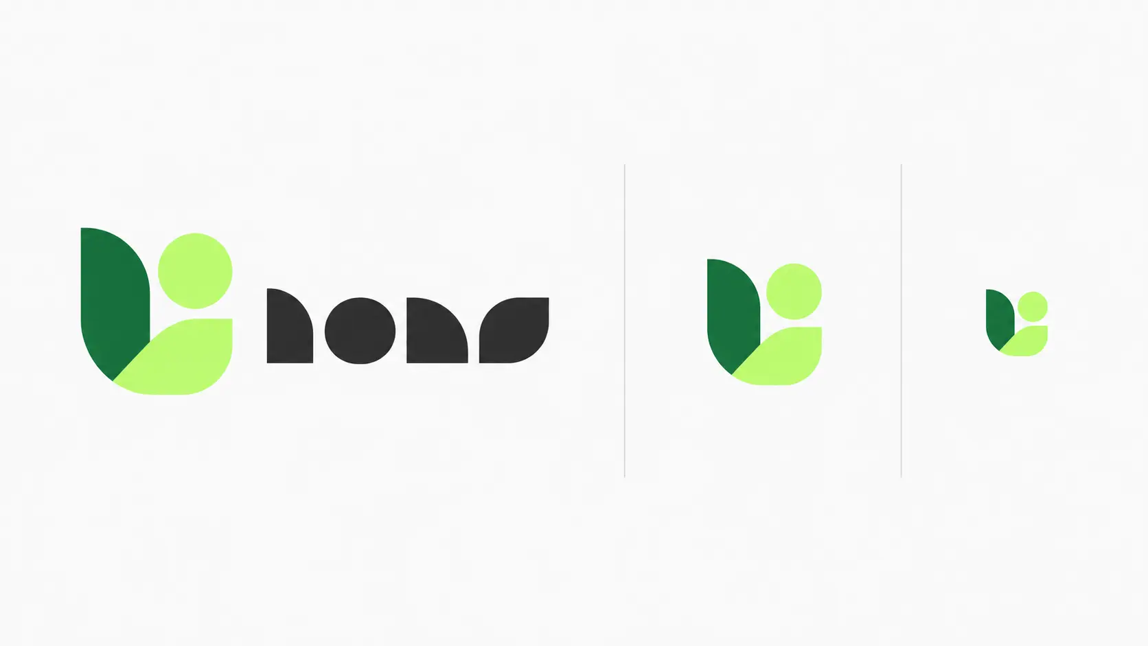
What makes this approach useful? A brand can use the full wordmark on its website, a compact version on packaging, and a simplified mark as a favicon without treating each application as a separate design problem.
What can go wrong? If the simplified mark loses everything distinctive about the original logo, it becomes just another generic icon. Each variation should be recognizable and tested at its intended size.
2. Expressive and Custom Typography
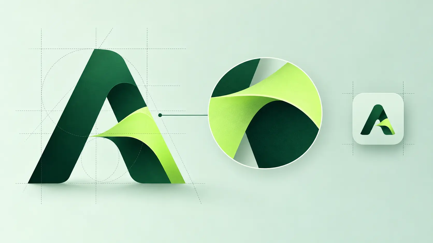
Typography doesn’t always need unusual letterforms to create a clear identity. In the VINS Agency branding project, the logo, typography, and color system were developed together to establish a consistent visual direction.
A useful test: Show the wordmark at approximately the size it would appear on a mobile website. Can someone read the brand name without having seen it before? If not, the typography may be competing with its primary purpose.
3. Minimalism with Personality
The Wildercroft Studio logo design project shows how concept exploration and refinement can lead to a distinctive mark that becomes part of a wider visual identity.
The trade-off: Simplicity improves flexibility, but removing too much can make a brand look anonymous. The aim isn’t to create the fewest possible shapes; it’s to keep the details that matter.
4. Bold and Maximalist Logo Styles
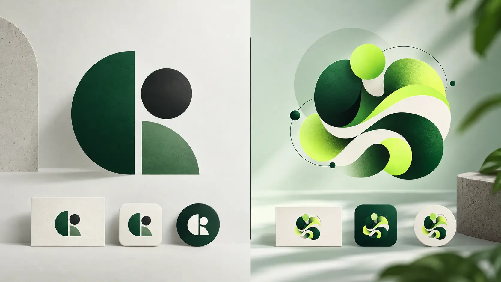
This approach can make sense for brands whose personality is playful, experimental, or deliberately unconventional. But bold design needs structure just as much as minimalism does. Without a clear visual hierarchy, expressive elements can compete with one another instead of working together.
Before committing to a maximalist direction, test the logo in a single color and at a small size. If the design becomes difficult to recognize, some of its expressive details may work better as supporting brand elements rather than parts of the logo itself.
5. Animated and Kinetic Logos
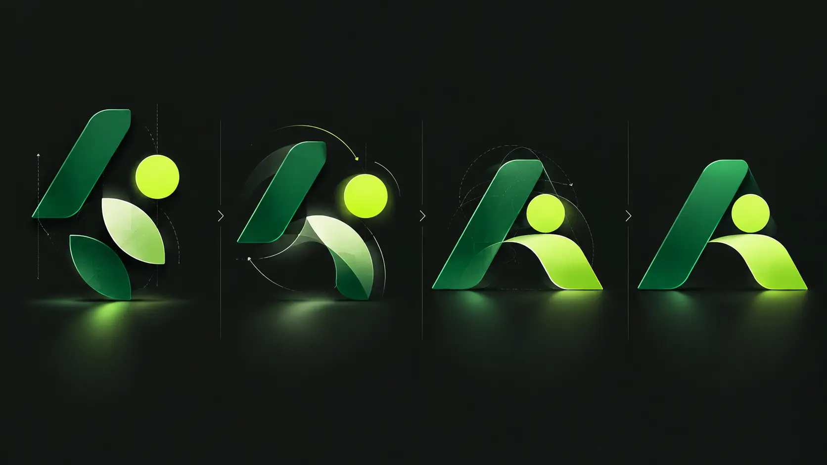
What matters in practice: Start with a recognizable static logo, then develop motion around its existing shapes, proportions, and visual character. Keep animations short, avoid unnecessary repetition, and provide a static alternative for environments where movement isn’t appropriate.
On websites, the prefers-reduced-motion media query can help respect visitors who request reduced animation through their device settings.
6. Retro-Inspired Identities
The better approach: Identify which historical details carry the intended character, then adapt them to modern applications. Sometimes a distinctive typeface and restrained color palette communicate the reference more effectively than reproducing an entire vintage style.
7. Handcrafted and Imperfect Details
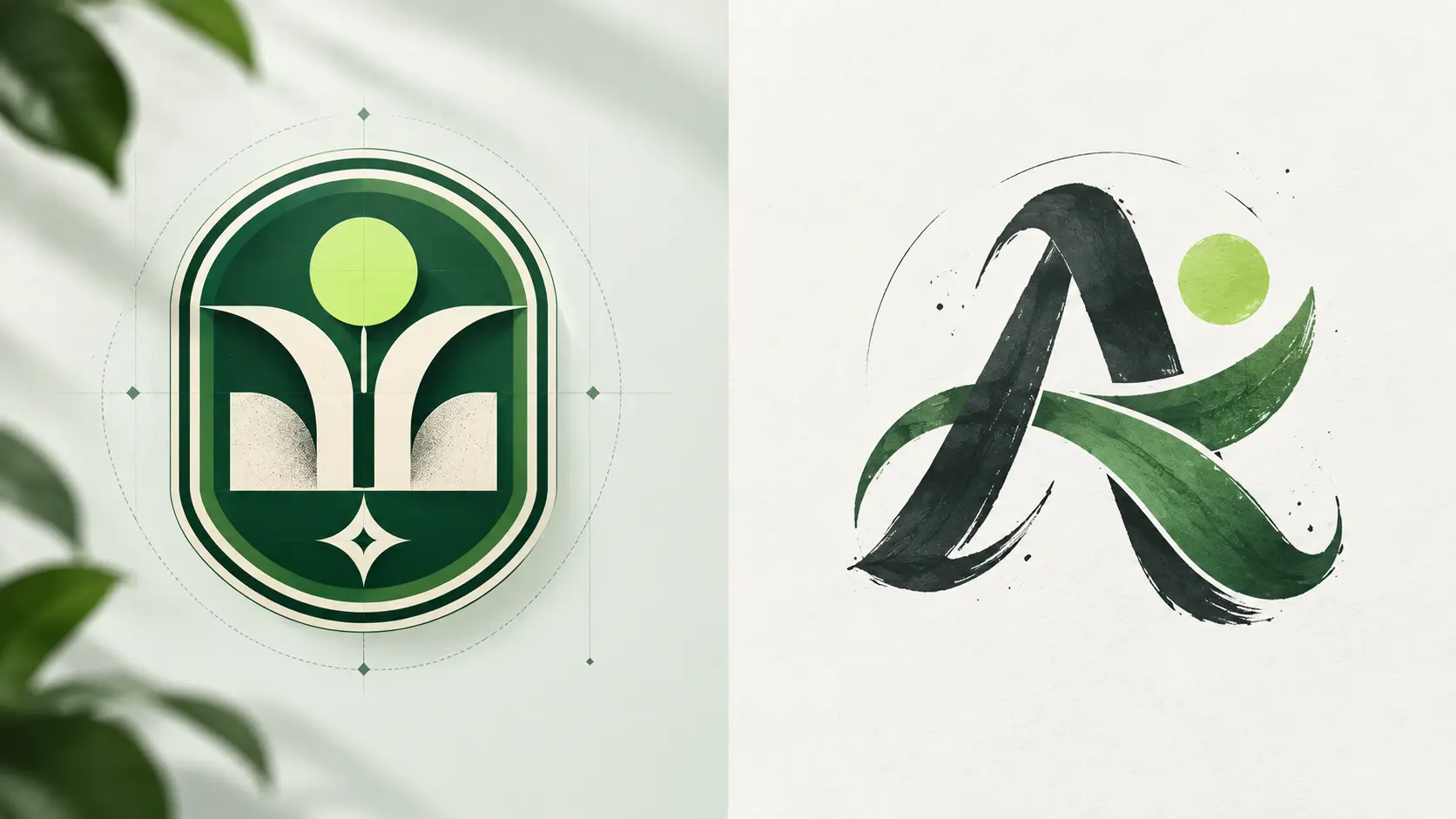
A useful design decision: Keep the primary logo clean enough to reproduce reliably, then use richer handmade textures and illustrations throughout the wider brand identity. This preserves the character without making every application technically difficult.
Hand-drawn details don’t have to live inside the logo itself. They can also become part of a broader illustration system for brand identity.
8. Dimensional Forms and Gradients
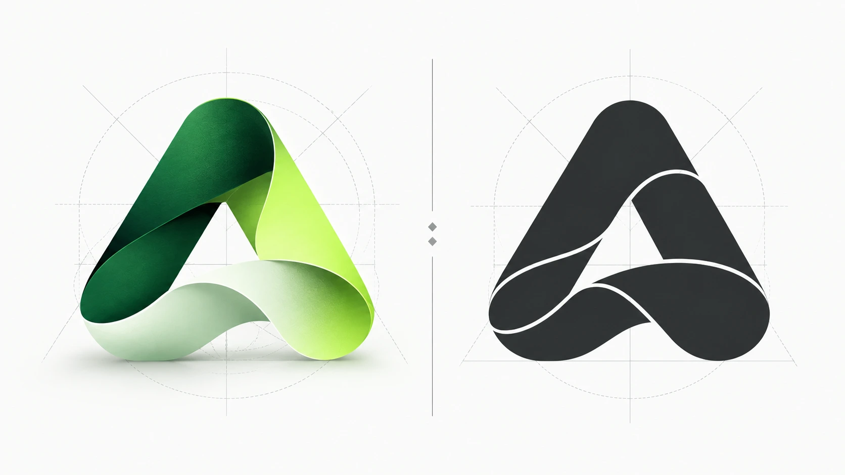
Before finalizing a dimensional logo, examine it in full color, flat color, black and white, and at a reduced size. If the essential shape disappears without its effects, the design may need a stronger foundation.
9. Geometric and Modular Symbols
What to evaluate: Remove the colors and look at the silhouette. Does the symbol have a feature worth remembering, or could it belong to almost any business?
10. Organic Shapes and Natural Influences
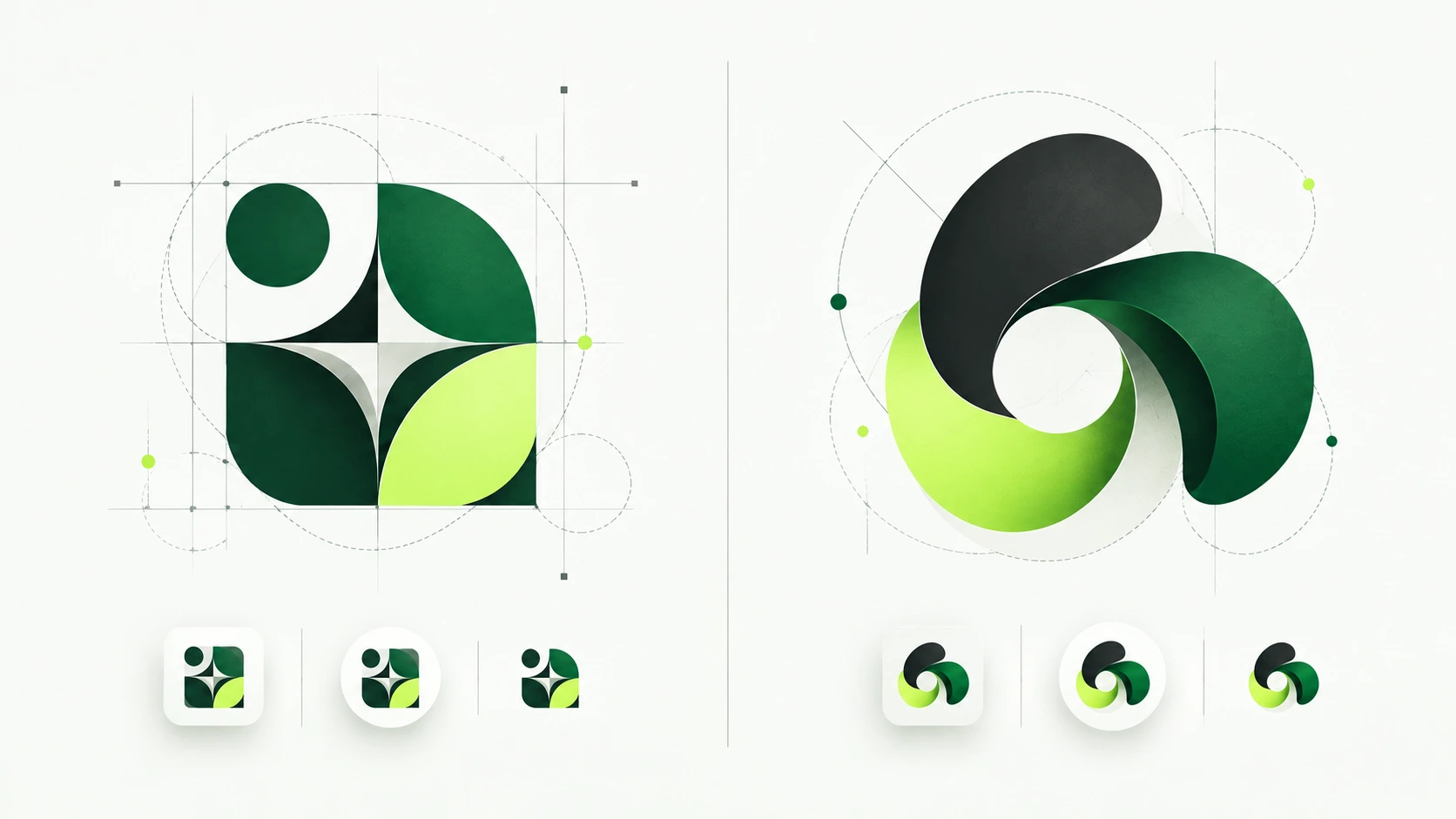
A practical check: Look at the logo without its supporting imagery or color palette. If the shape still communicates the intended character and remains recognizable, the organic approach is doing more than adding decoration.
How to Choose the Right Logo Style for Your Brand
1. Start with the Brand, Not the Trend
These decisions belong to a wider identity process. Our branding design guide explores the relationship between logos, typography, colors, and brand consistency.
2. Test the Logo Where People Will Actually See It
3. Separate the Logo from the Wider Brand Identity
4. Check Whether the Design Can Last
Conclusion
The better question isn’t which logo design trend looks the most impressive. It’s which elements are worth keeping once the decorative effects are removed. A recognizable, adaptable identity gives a business more room to evolve without having to redesign its logo whenever visual preferences change.