TL;DR
- Current illustration trends (minimalism, hand-drawn, mixed media) and how brands like Dropbox and Airbnb use them
- The design principles behind illustrations that actually reinforce brand identity
- How to brief and collaborate with an illustrator to get results that match your brand
Introduction
Visual identity — everything from your logo to your website design — shapes how people see your brand.
For small businesses launching or redesigning a WordPress site, illustrations are often what separates a templated look from a brand that actually stands out.
Well-designed illustrations help brands express their message, connect with their audience, and distinguish themselves from competitors.
Understanding Brand Identity
Definition and Components of Brand Identity
Brand identity is the collection of elements — name, logo, color palette, typography, and visual style — that a company uses to present itself to the world.
These components work together to create a cohesive, memorable image. A strong brand identity reflects your company’s values, mission, and personality, and stays consistent across every platform.
These components work together to create a cohesive and memorable image of your brand.
How Visual Elements Like Illustrations Contribute to Brand Perception
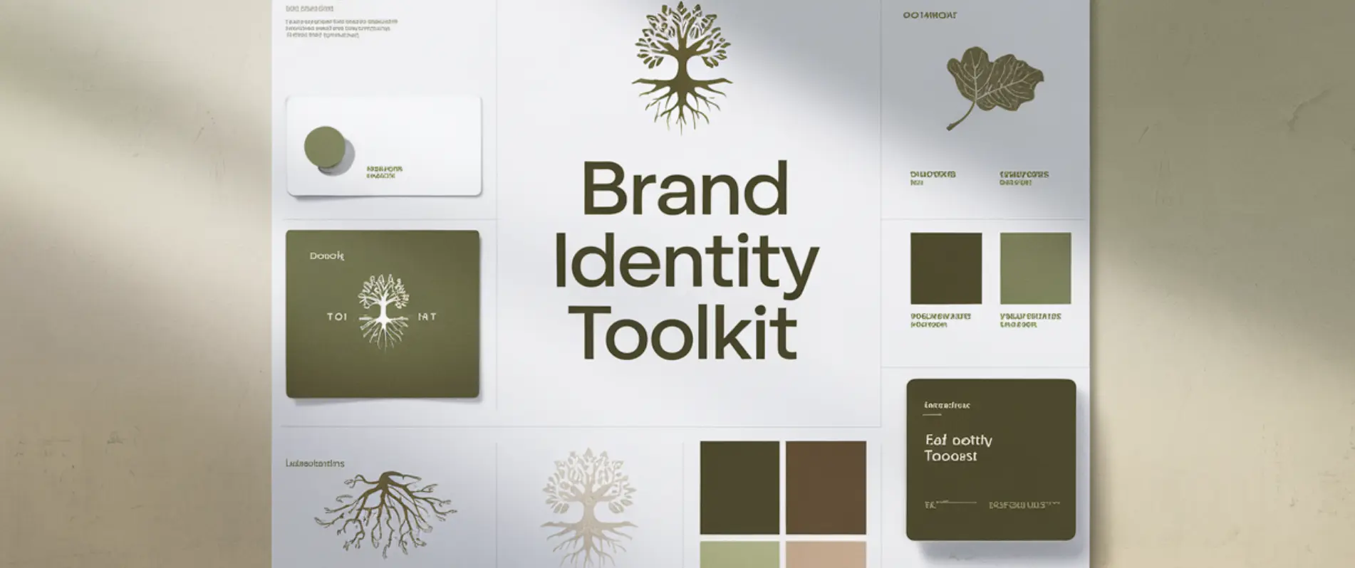
The Impact of Great Illustrations on Brand Identity
Visual Appeal: How High-Quality Illustrations Attract and Engage Audiences
Research from the Nielsen Norman Group on visual design principles confirms this: strong visual systems build user trust and reinforce brand perception, not just aesthetics.
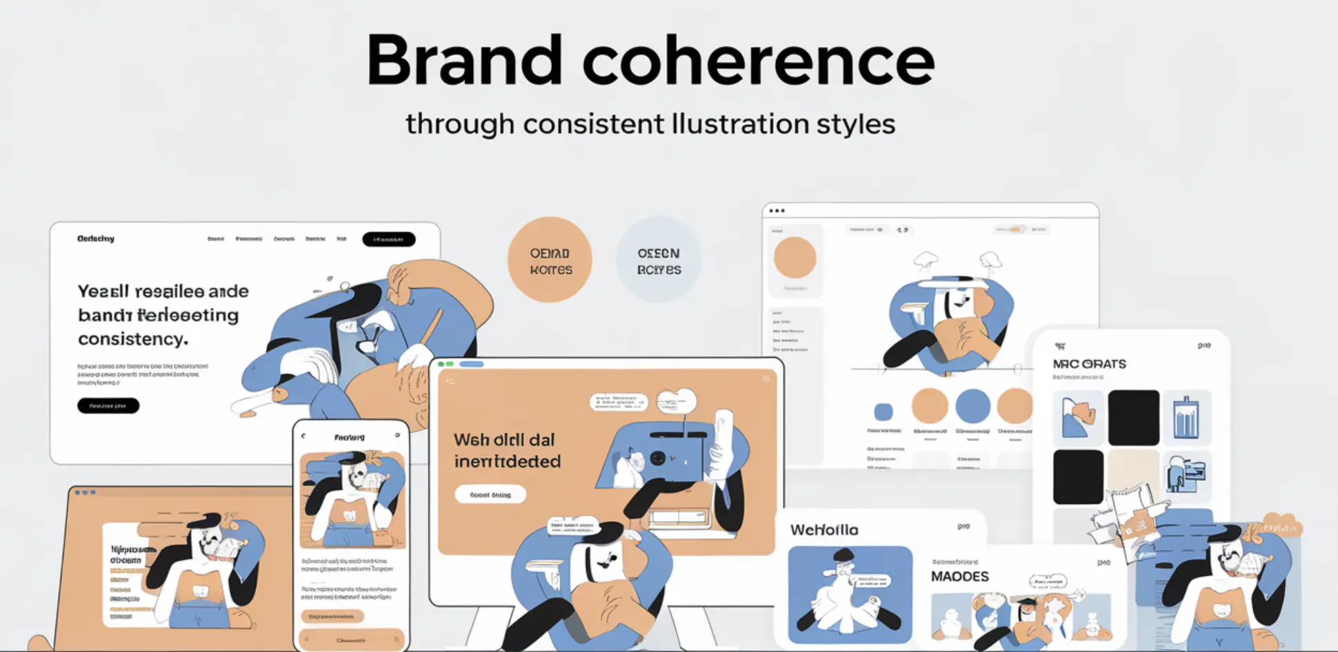
Consistency: Maintaining Brand Coherence Through Illustration Styles
Differentiation: Standing Out from Competitors with Unique Illustrations
Most small business websites pull illustrations from the same handful of free libraries — the same characters, poses, and color palettes end up on hundreds of competitor sites, sometimes in the same industry. Custom illustrations break that pattern instantly: no competitor can point to your hero graphic or icon set and say “we have that too.”
Trends in Illustration Design for Branding
Current Trends in Illustration Design
Illustration design continues to evolve, with several key trends shaping how brands use illustrations to enhance their visual identity:
2. Hand-Drawn Styles: Hand-drawn illustrations bring a personal and authentic touch to branding. They offer a unique, artisanal feel that can make your brand appear more approachable and human.

Examples of Brands Using These Trends Effectively
1. Minimalism: Google and Headspace use minimalist illustration systems to maintain a clean, approachable appearance — clean shapes and a tight color palette that stay recognizable across every touchpoint.
3. Mixed Media: The fashion brand Anthropologie uses mixed media illustration — watercolor, digital art, and collage — to create a vibrant, varied visual style that highlights its diverse products.
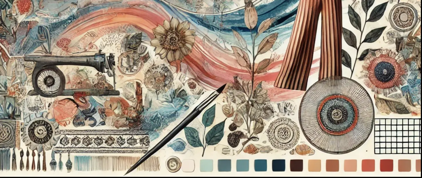
A 2026 analysis from Creative Boom of recent brand-illustration campaigns found that the strongest results came from treating illustrators as creative partners rather than outsourced labor — the illustrator’s personal style needs to genuinely match the brand’s personality, not just fill space.
Creating Effective Brand Illustrations
Understanding Your Brand: Aligning Illustrations with Brand Values and Personality
Design Principles: Key Principles for Creating Impactful Illustrations
Color Theory: Colors carry psychological weight — blue signals trust, orange signals energy and creativity. Choose illustration colors that match what you want your brand to communicate, and stay within your existing brand palette rather than introducing new ones.
Composition: Balance, contrast, and focal points determine whether an illustration reads clearly at a glance or gets lost. Good composition guides the eye to what matters first.
Technical Fit: This is the principle most guides skip. An illustration that looks great as a hero image can break as a small favicon or blog thumbnail. Before finalizing a style, check how it holds up at different sizes and on both light and dark backgrounds — especially important for WordPress websites, where the same illustration set often needs to work across headers, icons, and mobile breakpoints.
Tailoring Illustrations to Fit Specific Brand Needs
Creating Unique Designs: Skip generic stock illustration libraries — custom designs are what actually differentiate a brand, as covered above.
Adapting to Different Platforms: Illustrations need to adapt across formats: full-width hero banners, square social posts, small icons, and blog featured images. Include your color palette, logo design, and typography in the illustration set so every version stays recognizably yours, whether it’s shown as a hero image or a 40px icon.
Case Studies
Examples of Successful Brand Transformations Through Illustration
Dropbox: Dropbox revamped its brand identity in a rebrand led by design studio COLLINS, introducing custom illustrations that reflect its shift from “knowledge workers” to “creative workers.”
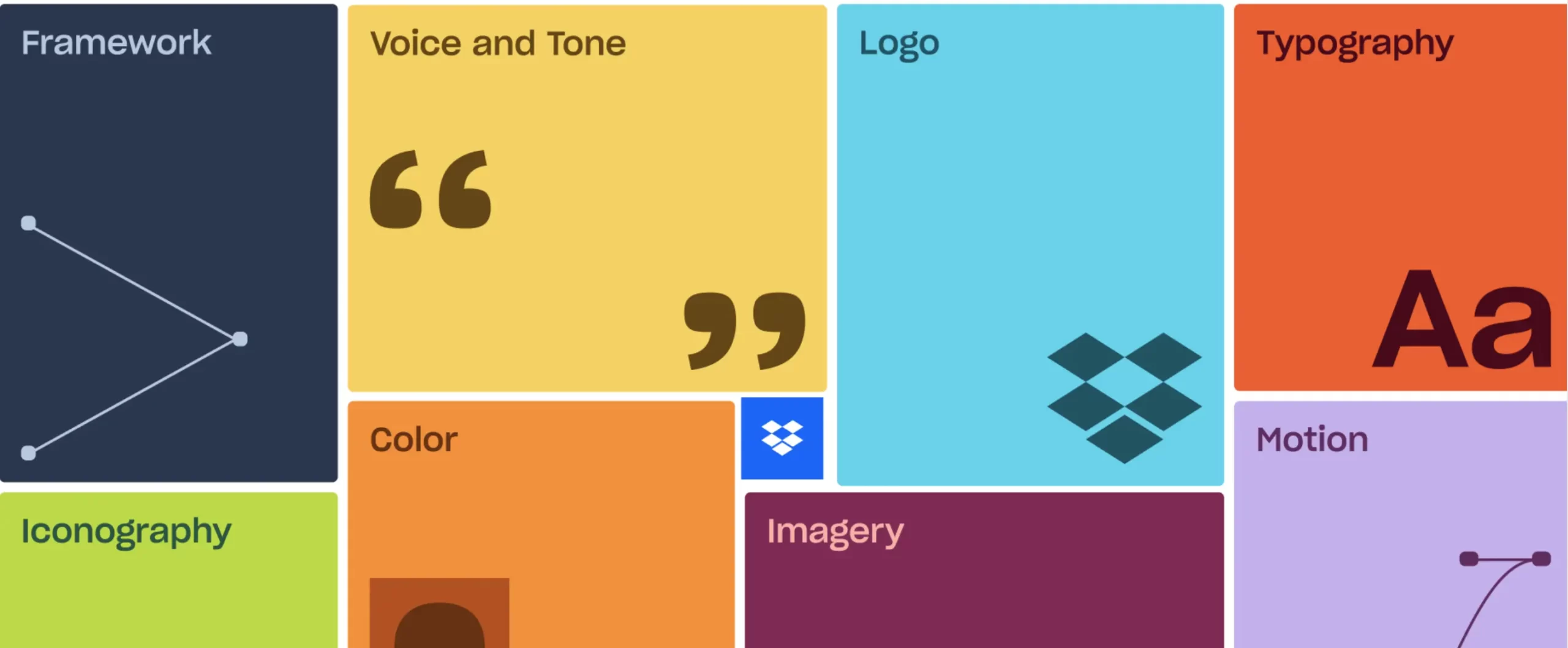
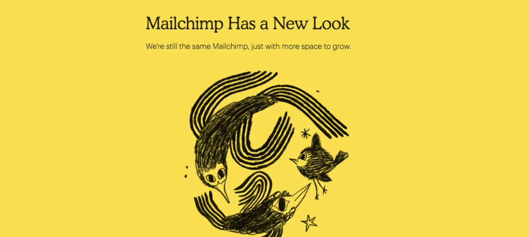
Mailchimp: Mailchimp’s hand-drawn illustrations, created by illustrator Franz Lang as part of its rebrand, give the brand a unique and engaging personality.
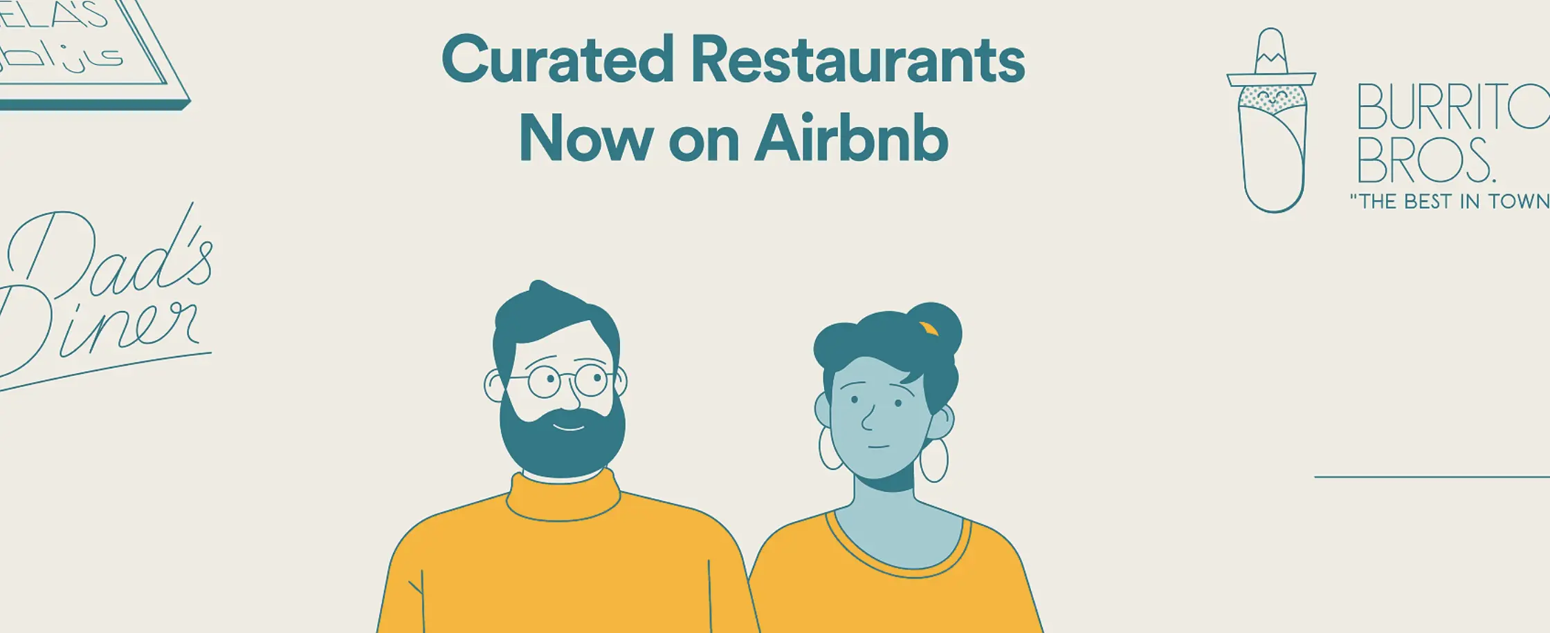
Airbnb: Airbnb transformed its brand around the concept of “Belong Anywhere,” using flat illustration to bring the idea of community and connection to life across its interface and marketing.
Analysis of What Worked and Lessons Learned
1. Alignment with Brand Values: The illustrations in each case reflected the brand’s core values and repositioning — Dropbox’s shift toward creative work, Airbnb’s emphasis on belonging.
2. Engagement and Recall: Successful brands use illustrations to engage their audience and improve brand recall. Unique styles and creative designs help these brands stand out and connect with their target market.
3. Consistency and Flexibility: In every case, the illustration wasn’t an afterthought bolted onto an existing design — it was built with dedicated illustrators or design studios who understood the brand’s positioning first. That’s consistent with what design publications are finding across the industry in 2026: illustration works best when it’s treated as a creative partnership, not decoration added at the end.
Tips for Working with Illustrators
How to Brief Illustrators and Communicate Your Brand Vision
1. A clear brief — project scope, target audience, and what the illustrations need to communicate, not just “make it look good.”
2. Your brand guidelines — color palette, typography, and existing visual references, so new work fits what’s already there instead of becoming its own thing.
3. Style references — two or three examples of illustration styles you like (and one or two you don’t). This does more than a paragraph of description ever will.
4. A defined timeline and revision count, set before work starts, not after the first draft comes back.
What Actually Makes the Collaboration Work
Conclusion
Ready to give your brand a visual identity that’s actually yours? Explore our design services or get in touch — we’ll help you figure out where illustration fits into your brand, not just what it should look like.
FAQ
How much do custom brand illustrations cost?
Costs vary widely based on illustration complexity, number of pieces, and whether you need a full illustration system or a handful of standalone graphics.
A single hero illustration typically costs less than a complete brand illustration library covering icons, backgrounds, and social assets. Get a quote based on your specific scope rather than a flat industry number.