Your website’s fonts are making a first impression, whether you planned it or not.
Research shows that users form an opinion about a website in as little as 50 milliseconds. Long before they read a headline or click a button, they’ve already felt something. And a big part of that feeling comes from typography.
Web design typography isn’t just about picking a font you like. It’s about creating visual hierarchy, guiding the user’s eye, reinforcing your brand, and making content effortless to read across every screen size.
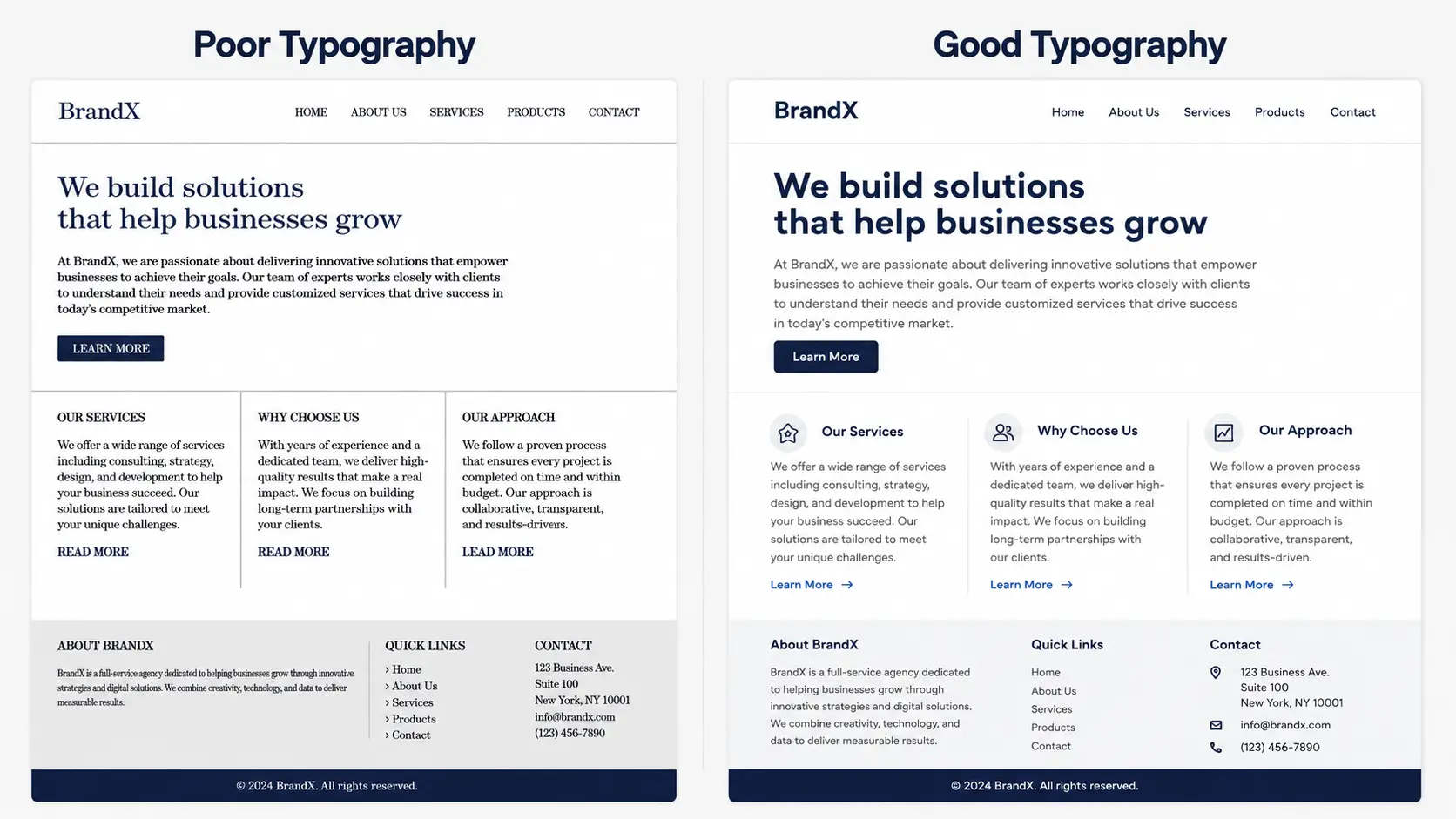
Get it right, and your website feels professional and trustworthy. Get it wrong, and visitors leave — often without knowing why.
In this complete guide, we cover everything you need to know about typography in web design: font types, psychology, pairing, visual hierarchy, variable fonts, and the tools that make it all easier.
Why Typography Matters in Web Design
Early fonts reflected the calligraphic styles of scribes, emphasizing readability and practicality.
It builds trust before anyone reads a word. Fonts carry personality. A poorly chosen typeface signals carelessness. A well-chosen one signals professionalism — instantly.
It guides users through your content. Clear visual hierarchy tells the reader where to look first, what’s important, and what to do next. Without it, people skim, get confused, and leave.
It reinforces your brand identity. Your fonts are part of your brand. They should feel consistent across your website, your logo, your marketing materials — everything.
It impacts SEO and page performance. Fonts affect load speed, readability scores, and time-on-page — all signals Google pays attention to.
It improves accessibility. Good typography means more people can read your content comfortably, including users on mobile, users with visual impairments, and users on slower connections.
Types of Fonts in Web Design
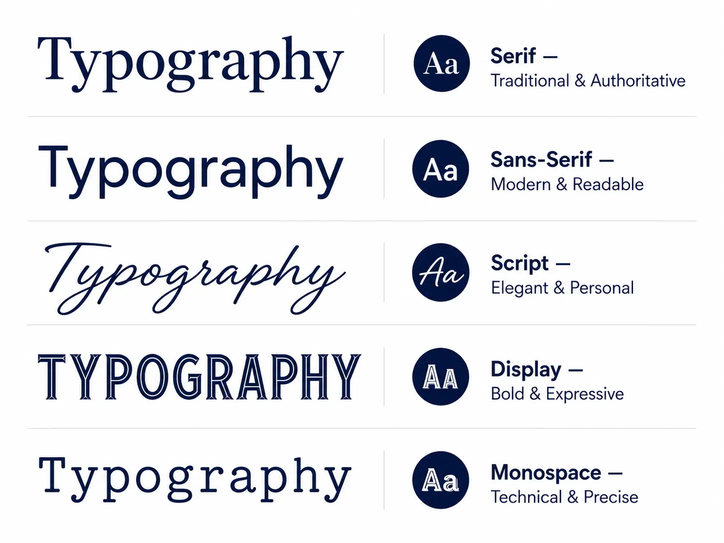
Serif fonts have small decorative strokes at the ends of letterforms. They feel traditional, authoritative, and trustworthy. Think Times New Roman or Garamond. In web design, serifs work well for editorial content, finance, law, and any brand that wants to communicate credibility and heritage.
Sans-serif fonts drop the decorative strokes entirely. Clean, modern, and highly readable on screens — which is why they dominate the web. Inter, Helvetica, and Open Sans are classic examples. If you’re building a tech product, SaaS platform, or modern service business, sans-serif is usually your starting point.
Script fonts mimic handwriting and calligraphy. They can feel elegant and personal, but they’re hard to read at small sizes. Use them sparingly — a short headline, a signature, a pull quote. Never body text.
Display fonts are designed to grab attention. Bold, decorative, and full of personality. They work beautifully in hero sections and large headings, but lose their charm — and readability — the moment you scale them down.
Monospace fonts give every character the same width, like a typewriter. They’re common in code snippets and tech interfaces, and occasionally used as a design accent for a retro or technical aesthetic.
The practical rule? Most websites do well with one sans-serif for body text and one complementary font for headings. More on that in the font pairing section below.
The Psychology of Typography
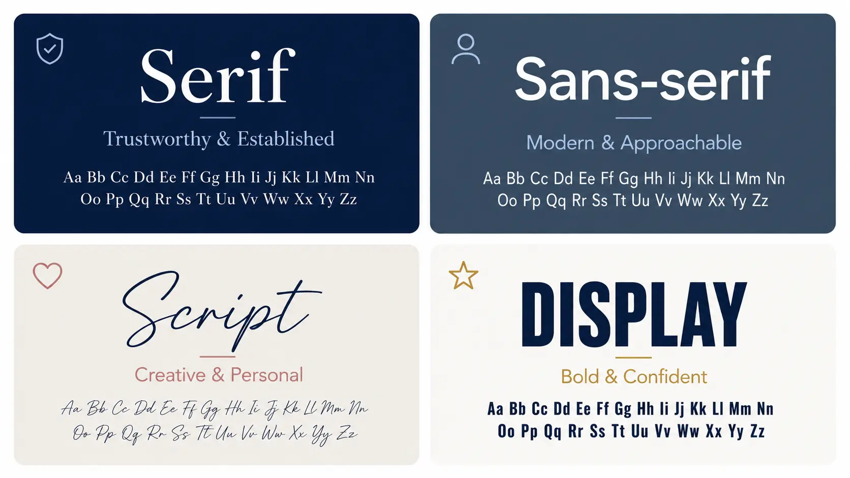
Serif fonts feel established and reliable. This is why banks, law firms, and legacy media brands lean on them. When you see a serif typeface, your brain associates it with tradition, authority, and credibility.
Sans-serif fonts feel modern and approachable. Tech companies, startups, and digital-first brands almost universally use sans-serif. It reads as clean, forward-thinking, and easy to engage with.
Script fonts feel personal and creative. Used well, they add warmth and a human touch. Used poorly, they feel unprofessional or unreadable. The line is thin.
Display fonts feel bold and confident. They demand attention. That’s their job. But overuse them and the effect disappears entirely.
Font size signals importance. Larger text says this matters. A clear size hierarchy guides the reader naturally from headline to subheading to body — without them even noticing.
Spacing affects comfort. Tight letter spacing feels urgent or compressed. Generous line spacing feels calm and easy to read. Most websites actually under-space their body text, making it harder to read than it needs to be.
Font weight creates contrast. Bold text draws the eye. Use it intentionally for key statements, CTAs, or critical information — not decoratively.
Color interacts with type. Dark text on a light background remains the most readable combination for long-form content. Always ensure a contrast ratio of at least 4.5:1 for body text.
Visual Hierarchy and Typography
Visual hierarchy is one of the most important and most overlooked concepts in web design. And typography is its primary tool.
Size
The largest text on the page should be the most important. Your H1 headline sets the tone. H2s break content into digestible sections. H3s and H4s add further structure within those sections. Each level should be noticeably different in size — not just a few pixels apart.
Weight
Bold text naturally draws the eye. Use it to highlight key statements, important terms, or calls to action. But use it sparingly — if everything is bold, nothing is.
Color and contrast
A slightly muted color for body text and a stronger color for headings creates a natural reading flow. You can also use a brand accent color selectively to draw attention to specific elements
Spacing
White space is not wasted space. Generous padding around headings, adequate line height in body text, and clear separation between sections all make the hierarchy easier to follow. A good starting point is a line height of 1.5–1.6 for body text.
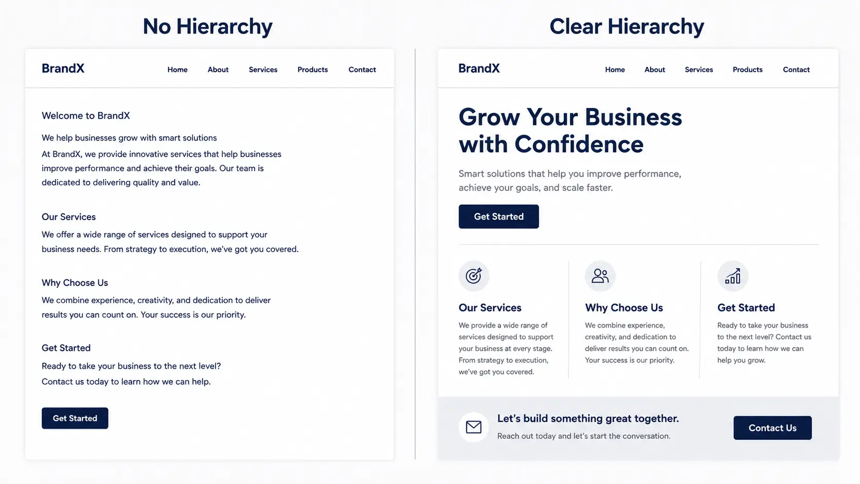
- H1 — one per page, your primary message, largest and boldest
- H2 — main section titles, clearly subordinate to H1
- H3/H4 — supporting points within sections
- Body text — comfortable reading size, minimum 16px, line height 1.5+
- Captions and labels — smallest, always clearly distinct from body
How to Choose and Pair Fonts for Your Website
Font pairing is one of the most practical typography skills in web design. The goal is simple: choose fonts that complement each other without competing. In practice, it’s where a lot of websites go wrong.
Here’s a straightforward framework for making smart font decisions.
Start With Your Brand Personality
Before opening Google Fonts, ask yourself what your brand needs to communicate. Professional and authoritative? Friendly and approachable? Creative and bold? Your fonts should reflect that answer before anything else.
Stick to Two Fonts Maximum
Use Contrast, Not Conflict
Consider Readability First, Aesthetics Second
Reliable Font Pairing Formulas
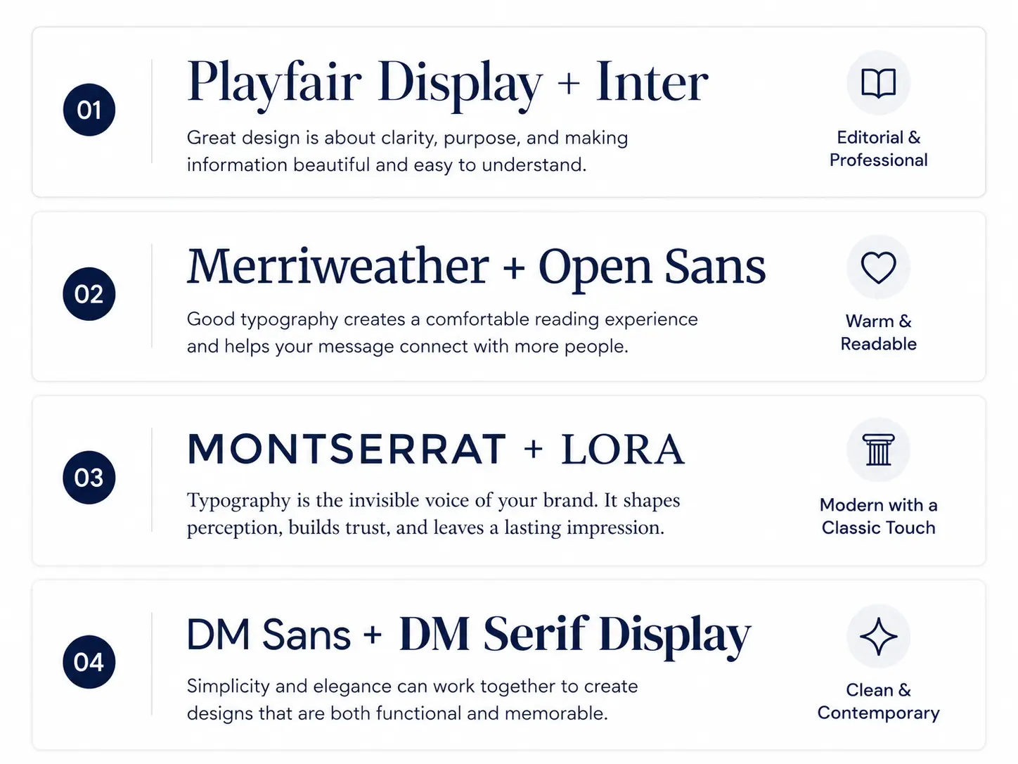
- Playfair Display + Inter — editorial, professional, great for agencies and consultancies
- Merriweather + Open Sans — warm, readable, works across almost any industry
- Montserrat + Lora — modern with a classic touch, strong for branding-focused sites
- DM Sans + DM Serif Display — clean and contemporary, excellent for SaaS and tech
Tools That Make Font Pairing Easier
- FontPair — curated Google Fonts pairings
- Typewolf — real-world font combinations used on live websites
- WhatTheFont — identify any font from an image
Variable Fonts and Web Performance
Variable fonts are one of the most significant developments in web typography in recent years and most websites still aren’t taking advantage of them.
What Are Variable Fonts?
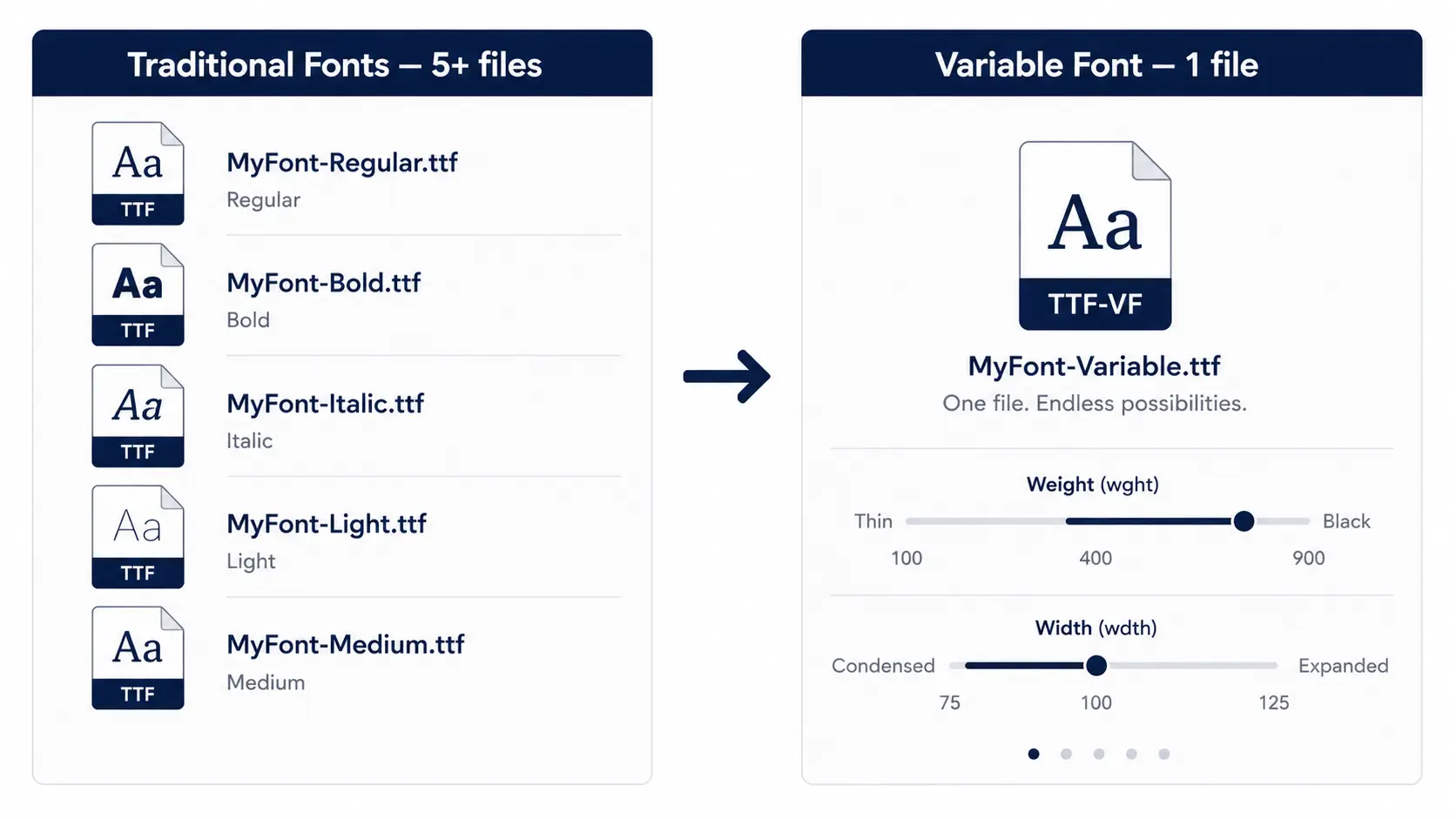
A variable font packs multiple styles into a single file. Weight, width, slant, and other attributes become adjustable axes — meaning you can have infinite variations of a typeface without loading multiple files. One file replaces many.
Why Variable Fonts Matter for Your Website
Faster load times. Fewer font files means fewer HTTP requests and less data transferred. This directly improves your page speed scores — a ranking factor Google takes seriously.
Better responsive design. Variable fonts let you fine-tune typography at every breakpoint without switching font files. A heading can subtly shift in weight as it scales down for mobile — maintaining visual impact without compromising readability.
Improved accessibility. Users who need larger text or higher contrast can benefit from smoother typographic adjustments across devices and settings.
Are Variable Fonts Widely Supported?
Creative Typography in Branding and Logo Design
Typography isn’t just a functional element of web design — it’s one of the most powerful branding tools you have. And nowhere is this more evident than in logo design and brand identity.
How Typography Shapes Brand Identity

Custom Typography vs. Standard Fonts
Standard fonts from Google Fonts or Adobe Fonts are a perfectly good starting point, especially for smaller businesses and early-stage brands. They’re free, well-optimized, and widely tested.
Typography Consistency Across Touchpoints
Best Font Tools and Resources for Web Designers
Font Libraries
- Google Fonts — the largest free font library on the web, fully optimized for web use and easy to implement in WordPress
- Adobe Fonts — high-quality commercial fonts included with any Adobe Creative Cloud subscription
- Font Squirrel — free, commercially licensed fonts with a strong focus on web-ready typefaces
Font Pairing and Inspiration
- FontPair — curated Google Fonts pairings organized by style
- Typewolf — real-world examples of fonts used on live websites, updated regularly
- Fonts In Use — a searchable archive of typography in real design contexts
Testing and Identification Tools
- WhatTheFont — upload any image and identify the font used in seconds
- Axis-Praxis — interactive playground for testing variable fonts
- WebAIM Contrast Checker — verify that your text meets accessibility contrast standards
Conclusion
FAQ
What is the best font for a website?
How many fonts should a website use?
What is the difference between serif and sans-serif fonts?
How does typography affect user experience?
Directly and significantly. Poor typography — wrong font size, tight line spacing, low contrast, or mismatched typefaces makes content harder to read and increases bounce rates. Good typography guides users naturally through your content, builds trust, and makes every interaction feel effortless — all core principles of good user experience.